The Art of the Film Poster: First Impressions That Last Forever

Before a single frame comes onto the screen, before any dialogue is heard or read, a film speaks to us through its poster. In an era of endless scrolling and near infinite content, film posters remains one of cinema's most powerful tools. It's a greeting in a single image that must capture the essence of the film’s story.
A Brief Look Back
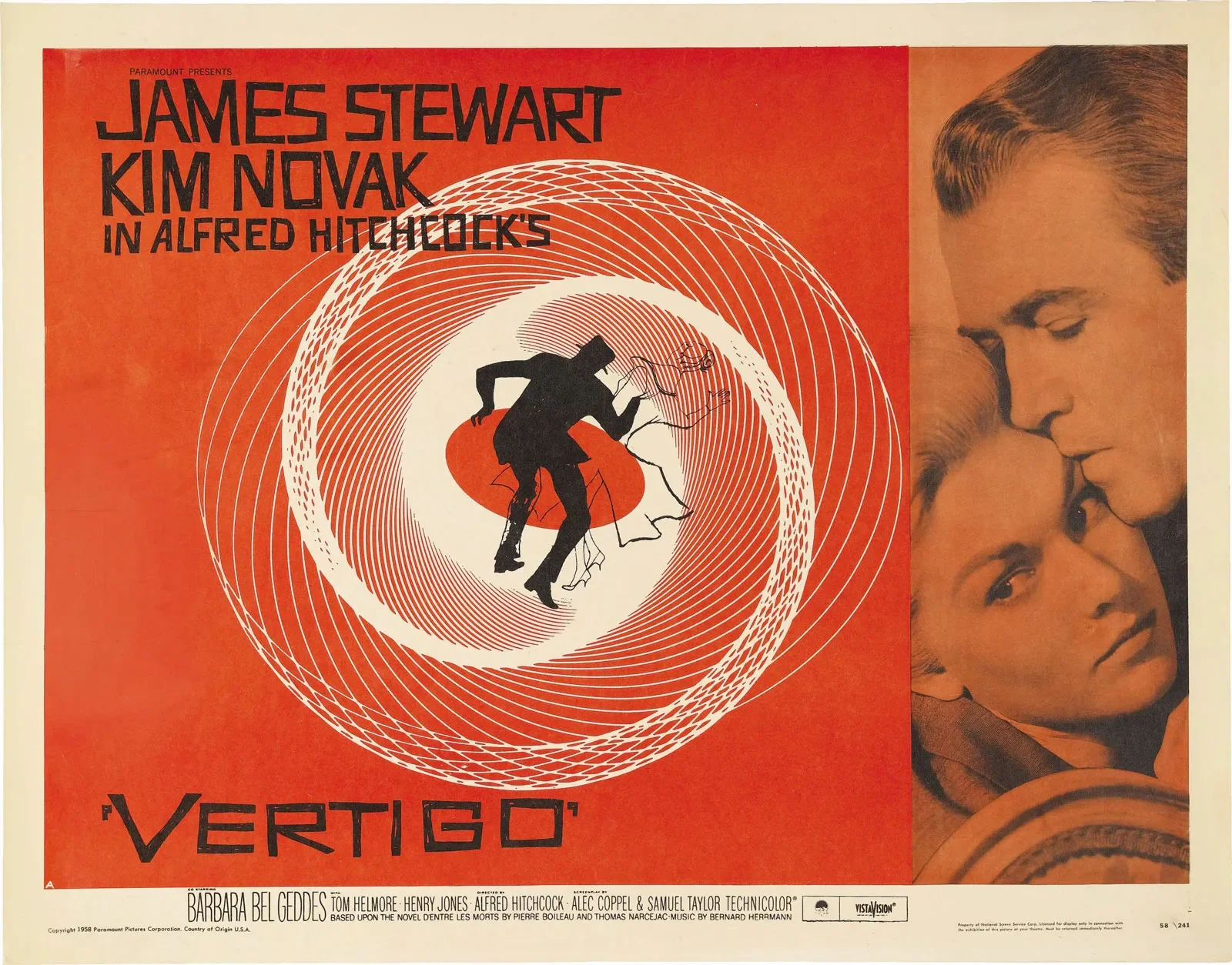
The golden age of film posters gave us some of cinema's most enduring images. Saul Bass revolutionised the form with his minimalist approach to films like Vertigo (1958) and Anatomy of a Murder (1959), proving that less is more. His spiraling forms and bold typography didn't just advertise movies; they became inseparable from the films themselves.
Meanwhile, the hand-painted posters of the 1970s and 1980s delivered drama and spectacle. Think of the iconic image of a woman swimming above a lurking shark in Jaws (1975), or the mysterious simplicity of Alien's (1979) glowing egg. These weren't just marketing materials. They were cultural artifacts.
But poster design hasn't remained frozen in the past. If anything, it has become more vital and more varied as filmmakers and designers respond to new challenges in how we discover and consume cinema.
The Modern Landscape
Today's film posters exist in a complex ecosystem and must be versatile. They need to work as thumbnail images on streaming platforms, as physical prints in theater lobbies, and as shareable content on social media. The best contemporary posters manage to succeed in all these contexts while still feeling like genuine art you’d hang on your wall.
The Lobster (2015) has a poster which features Colin Farrell in a red jacket against a stark white background, his expression bewildered and slightly pained. A simple image, but one that perfectly captures the film's blend of absurdism and melancholia. The minimalism works whether you're seeing it on a billboard or a phone screen, and the unsettling mood sets up the strange and unsettling world that Yorgos Lanthimos has become synonymous with.
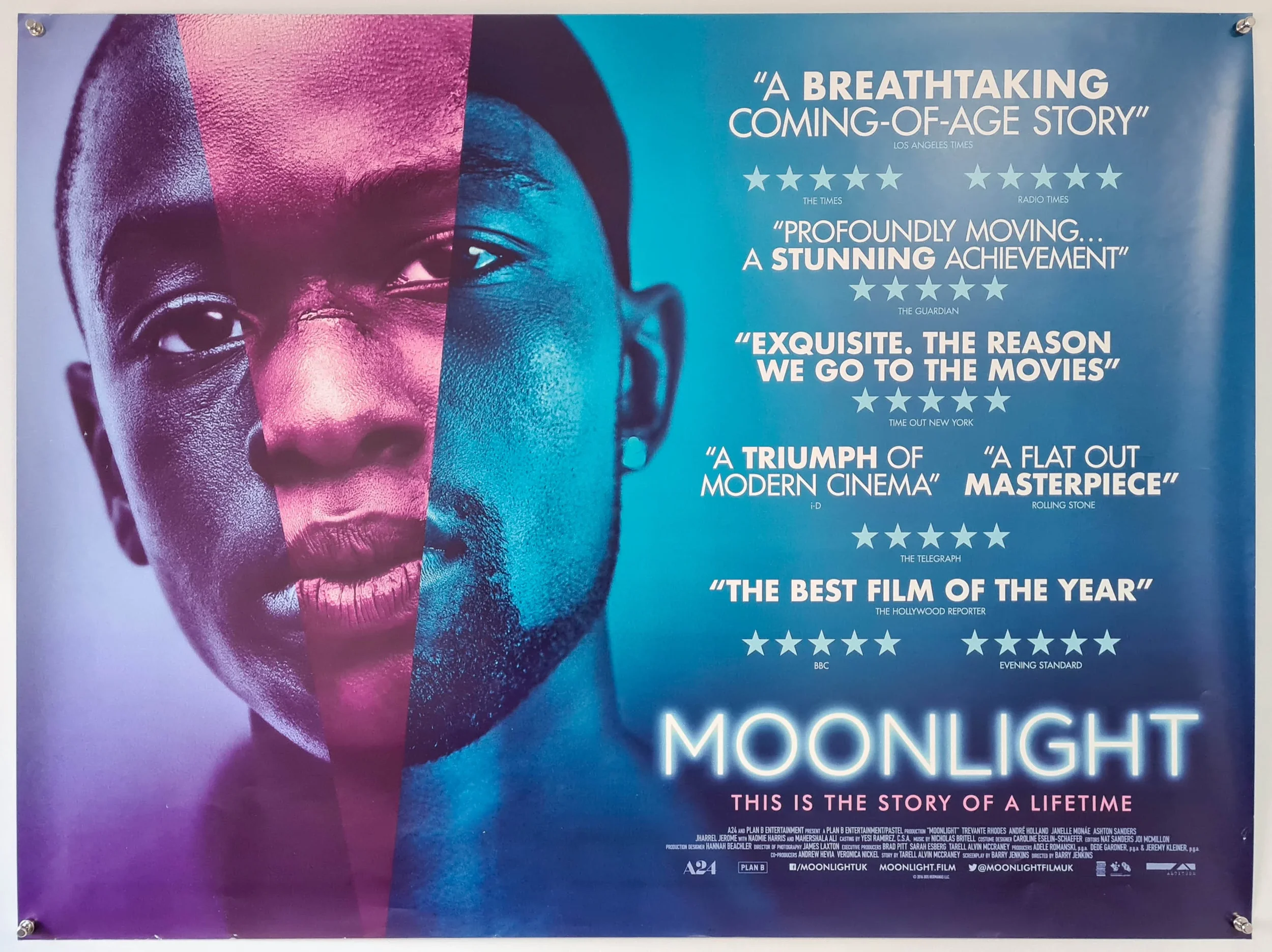
Moonlight (2016) took a different approach with its triptych poster showing Chiron at three stages of life, bathed in the film's signature blue tones. The design choice mirrors the film's three act structure and immediately communicates that this is a story about identity, transformation, and time. It's beautiful, yet informative enough to give potential viewers a genuine sense of what they're about to experience.
The Lighthouse (2019) embraced its vintage aesthetic with a poster that looks like it could have been printed a century ago. The stark black and white composition, the woodcut-style illustration, the compressed aspect ratio. Everything about it signals that this isn't a typical horror film. It's a descent into madness that draws from older traditions of storytelling and visual art.
Everything Everywhere All at Once (2022) faced perhaps the hardest challenge: how do you capture a multiverse-spanning, genre-blending, deeply emotional story in one image? The solution was controlled chaos. The poster layers images and text in a way that feels overwhelming but never quite tips into confusion, mirroring the film's own ambitious balancing act and gives a hint as to what the various universes have to offer.
International Perspectives
Different film cultures bring different sensibilities to poster design. The poster for Amélie (2001) is quintessentially French in its playfulness, with Audrey Tautou's mischievous expression and the warm color palette that defines the film's visual world. It invites you into a whimsical universe without needing to explain every detail.
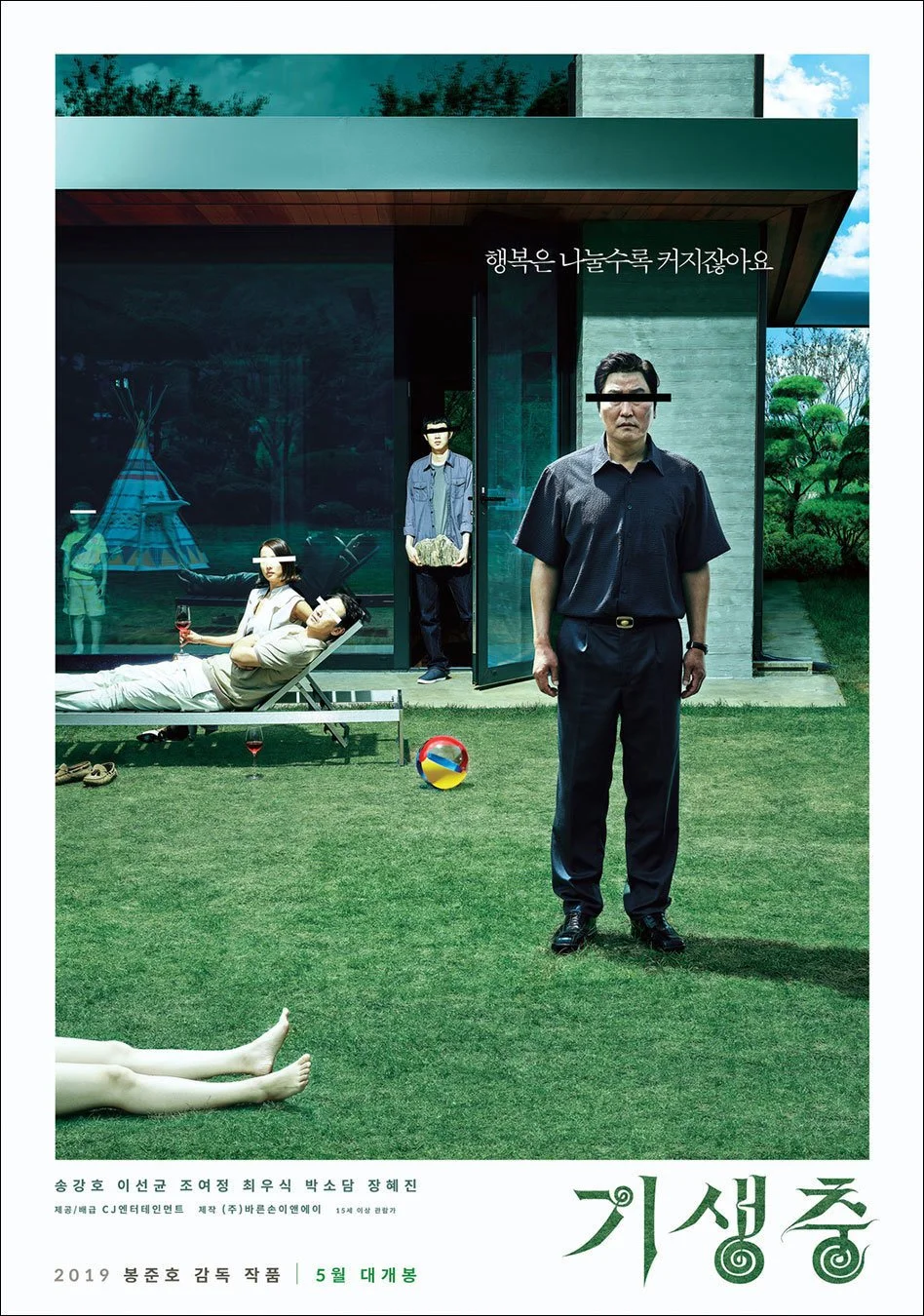
Parasite (2019) uses stark geometry and a clear division between the upper and lower portions of the frame, a visual metaphor so effective that it requires no knowledge of Korean cinema or culture to understand. The design is sophisticated but never obscure, a perfect match for Bong Joon-ho's film about class division that resonated globally.
What Makes a Poster Work
The most memorable film posters share certain qualities, regardless of style or era. They establish mood immediately. They suggest narrative without giving it away. They feature bold compositional choices that make them readable at any size. Most importantly, they feel connected to the film itself rather than generic or committee-designed.
A great poster also understands its audience. An art house film can afford to be subtle, to trust that its viewers will be drawn to mystery and ambiguity. A mainstream release might need clearer signals about genre and tone. Neither approach is inherently better; what matters is authenticity to the film's identity and story.
For filmmakers, especially those working independently or on shorts, the poster is often your film's ambassador to the world. It appears in festival programs, on submission platforms, and in social media posts. It's worth investing real thought into what image or design best represents your work. This doesn't require a huge budget. Some of the most striking posters are simple photographs or illustrations that capture a key moment, emotion, or visual motif from the film.
Looking Forward
As we move further into the streaming age, some worry that poster art will become less important. Why invest in a striking design when most people will see your film as a small rectangle among hundreds? But the opposite seems to be happening. With so much competition for attention, a distinctive poster becomes even more crucial. Films like The Grand Budapest Hotel, Hereditary, and Midsommar have proven that bold, artistic poster design can become part of a film's cultural footprint, inspiring fan art, merchandise, and conversations that extend far beyond opening weekend.
The film poster remains a guide to the audience on what they are about to watch. It has to capture the viewer with one eye-catching image and the very best do this effortlessly.